How to Judge a Logo Design: A New Approach
15 July 2020
There are quite a few articles and books out there on ‘what makes a good logo’, but here we present to you a few things to keep in mind should the day come that you invest in a logo.
Let's begin. What do all these logos above have in common?
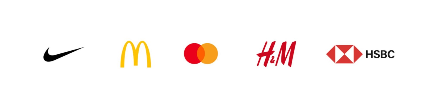
They all represent massive international companies? They’re all instantly recognisable on the high street? They barely need a company name alongside them to be identified?
All true. But there are two more things I’d like to bring to your attention. First, these logos are incredibly simple. They are not detailed, they are not overly complex in design, they are not difficult to draw (mostly just standard shapes). That in itself is a reason they are so easy to recognise and makes them classic examples of good logo design (link to other article).
The second point, and the purpose of this article, is this: Imagine when the logo for Nike, for example, was requested, the executives probably told the designer requirements like it must show that we’re the best shoe company in the world; that we’re all about athletics; we make excellent quality shoes; we’re proudly American; our shoes will make you faster; and a bunch of other things, no doubt. Then a few weeks later these executives are rubbing their hands with curiosity as the logo gets presented, wooosh, the curtain comes off and there in front of them is …is… a check mark. A simple, plain, ordinary, teachers-use-these-all-the-time check mark. ‘Where’s the creativity? Where’s the interest? Where’s the wow-factor?’, they all say. I mean, imagine the same scenario at Mastercard. “Just two circles?” They shout. “But we’re paying you thousands of dollars!” The same at McDonalds, they probably thought, “hmmm, just two arches to represent an ‘M’? No burger icon? Nothing about fast food? Is this really all we get?” Ah, but, these executives are not as stupid as they seem and that is why they’re so successful. They actually listened to the expert in the field, despite these initial protests, and did in fact go with the logo presented, as we know them still today (and there’s a lesson there).
The success of these logos really comes down to the success of these companies and their branding, and the designer has created them in just the perfect way to not interfere or distract from the product or service, and are allowed to be plastered upon every conceivable surface without difficulty, and slowly but surely become memorable marks amongst the public.
The logo does not scream brilliance or creative ingenuity (and yet they are for this reason). It is not a Picasso painting. It should be strong in its simplicity, basic in its understanding and undemanding in its functionality. A professional logo designer will know how to get down to these points. The result, to some people, however, may be underwhelming at first. So remember, do not expect to fall in love with a logo at first sight but know that over time, as your business thrives and your audience starts to perceive it in good light, you will.
From a practical point of view, the logo is often misunderstood for being some kind of magical conversion tool to get more clients or customers. Or instantly rise above a competitor. A good logo certainly succeeds in giving you a head start, but it is how you conduct business, and how that logo is attached to your business, that will actually set you apart. The logo is not quite the wowing, first-impression, instant hit we think it to be. It is instead the trusty identifier of your business for years and years to come. It’s there through hundreds of sales, presentations, orders, emails, meetings and interactions. It should sit politely and obediently on the table whilst you, personally, conduct your business. And when you’re not there it will fill in for you, as the face of your company.
Here’s a great case of how a logo can be so discreet but for that exact reason it is so timeless and powerful.

Look at the Fedex logo, one of the most famous logos ever made (seriously, Google ‘best logo ever’ and Fedex will consistently pop up). The logo is famous for having one of the most beautiful examples of the use of negative space (the arrow between the ‘e’ and the ‘x’). Funnily enough, despite this brilliant touch by the logo designer, many people (outside of design spheres) do not actually know about this. In other words, the logo designer, and the executives of Fedex (probably with some convincing), did not, at some point, get really excited about the hidden arrow and say “let's make it bright pink so everyone can see this remarkable arrow within the words”. No. No. The brilliance of the logo lies in that many people will not actually see it or realise it's there. But if they do, the company is valued further. It's a slow burn, subtle and not given unnecessary attention.
The point being, logos do not need to be blatantly clever. They do not need a ‘brilliant’ catch, or joke, or point. The truth is the Fedex logo actually works well because it is bold, easy to read and has a recognisable colour pairing (purple/orange), all of which mean its a great logo for the side of trucks that dash past us in a second. It’s quick and easy to recognise. These were the rational problems that needed to be solved by the designer for this client. As for the subliminal arrow… it was a lucky afterthought and certainly not the reason for Fedex’s worldwide success.
In conclusion, take your time building your company and its brand and the logo will fall into place.
Here's another great logo design article we wrote that compliments this one very nicely.
Here's another great logo design article we wrote that compliments this one very nicely.