What makes a bad logo
16 November 2022
In a couple of previous posts we spoke about what makes a good logo (see here and here), so to finish off this series we’ll look at what makes a bad logo and some of the mistakes that are made when finalising a logo design. Oftentimes the mistake is that people end up going for what they perceive as ‘nice’ without knowing that they are in fact choosing something that does not function well as a logo for a business. This can cause headaches for the company later on, and I do mean practically.
Of course, logo design, like most design, is very subjective in the eye of the beholder. Yet principles and ‘rules’ exist because design is more than just what looks good. It plays a vital role in everyone's lives and therefore it is a function before a visual delight. If you look around you, everything has been designed in the most appropriate way that the designer, or manufacturer, deemed fit. If the product works very well, then they have succeeded. If the product works very well and looks good then they have not only succeeded but made something that will most likely bring great joy to everyone who is involved, from manufacturer to seller to buyer. Here we can see the adage “good design is good business” at work. The more this balance is met the more successful the product is. But make no mistake, first and foremost, that product has to work very well.
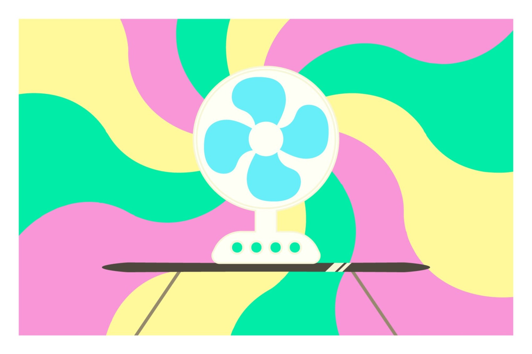
Here’s a quick example to illustrate the above. You buy a fan, it works well, has three settings and cools you down in summer. Ten years on it is still doing this. That’s great! Excellent product and money well spent. But it’s a bit unattractive. Your minimalistic-white-washed loft apartment is a bit thrown off by the now rusty wire casing and primary blue blades of the fan, with long, tangled black cord. It’s ok because it does such a good job, a real workhorse. But if this thing was brushed chrome, or matte white, with a sleek, inconspicuous appearance it would be so much better. So, you go out and buy one. Bit pricey, but you think it’s worth it. We’re all guilty. You get home, switch it on, and you have cool flowing air, plus your apartment looks immaculate now. Excellent, you think. But three months later you notice it has collected dust on the blades quite quickly, the whiteness is now a dull yellow and it makes a little whine every turn. The old workhorse never did this! And so, we see that something beautiful has failed quicker than something that was purely built for function. So form must follow function. The greatest achievement of course would come in when the old workhorse can get a facelift and look attractive in its intended environment, yet not compromise on its job at hand.
The following points look at how a logo, like a product (like a fan), can be unsuccessful because it hasn’t got the order of priorities right and therefore a nice balance has not been obtained. And just to be clear, a logo needs to be a workhorse. It needs to carry any self-respecting business for decades to come. You can’t change your logo whenever you feel like it, it’s damaging to the brand. So a lot of responsibility comes with a new logo design and it needs to be able to endure a lot of pressure from the rapidly changing world we live in. Unlike your old fan that is weathering away with the passing summers, the logo must always feel appropriate to the businesses goals now and for years to come.
Too much detail
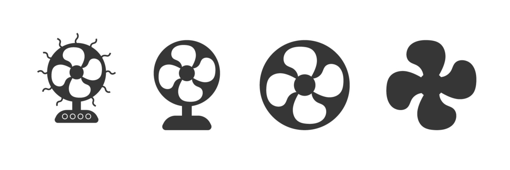
A logo is a mark. It is a little graphic. It is even a little picture. But it is not an elaborate artwork made to show off an intricate amount of detail. Everything should be reduced to its simplest form before becoming too obscure. And that’s a fine balance right there. Is a triangle enough to represent a mountain? Yes. Is a triangle enough to represent a tent? Yes. Ok, how about a whole house? Maybe (depending on the types of houses you deal with, A-frames, perhaps). How about a palace? Ok, no, you will probably need more detail in your logo design than just a triangle to represent a palace. But not much. A couple turrets and a large door should do. The flags, spires, windows, soldiers and moat can be skipped. Yes it would make it more realistic, but it would just create more chaos to the little mark. So why simplify? What’s wrong with details? The reason is that a logo, and therefore a company, needs to be seen, recognized and remembered in small sizes and quickly. Too much detail and you lose this functionality.
Not appropriate to the cause
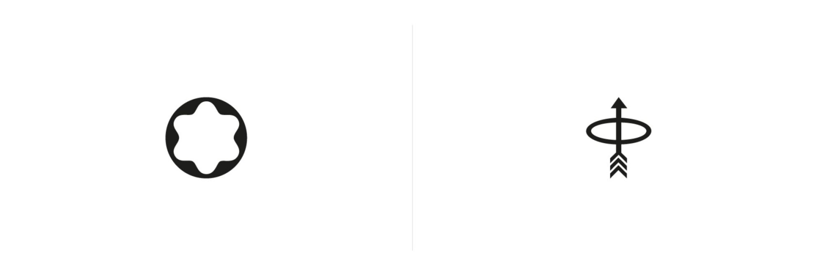
Continuing with the details, a logo must not lose its form or distinctiveness the smaller it gets, or the changing environment it finds itself in. Some logos look great at a good postcard size on a smooth, white background. But unfortunately we don’t always see them at this size and on such a forgiving background. This brings up a very useful ‘brief’ question between designer and client before the logo design process begins: Where will your logo be used? Let’s take the Coca-Cola logo for example, a beautiful, distinctive script that is possibly the most recognised logo in the world. It works brilliantly on the typical soft drink bottles and cans – glass, plastic or aluminium, and that along with the iconic red colour makes it a branding superstar. But now imagine if Coca-Cola wasn’t in the soft drink game, but instead they made pens. They were the Mont Blanc or Parker of the pen world. That Coca-Cola logo would not be so functional on the small amount of space given on a pen. It would be somewhat overbearing and ‘loud’, and if you reduced the logo’s size down to something relative to the pen, you might have trouble reading it. Pen companies have chosen small, refined logos. Mont Blanc has the simple star shape, Parker has an arrow in a circle with the arrow cleverly and discreetly used as the pen’s clip. This example shows us that logos should be designed for the space they are first and foremostly going to inhabit, and if you’re selling a product, it will most likely be on that. Other considerations would be the packaging, digital media (website, social media, mobile screen), the accessories to your product, your marketing material, and so on. It should also be considered that sometimes your logo will not come out in colour, such as on a receipt or in a newspaper.
Too literal
It’s amazing how well the human mind can make connections and sometimes logo designers, or whoever is calling the shots, underestimate this. Logos do not need to spell out what the company does. They don’t even have to come close. More important would be the symbolic meaning but even this can be fairly abstract. Humans looking at the logo will make the connections, and if they don’t the logo should be sound enough to remember anyway. To demonstrate what I mean, there’s an interesting experiment involving blind people being asked to draw a few objects. The people have been blind since birth. When asked to draw a moving wheel, they would often include motion lines. That is, little curved lines on the outside or inside of the wheel to show speed and movement. This little illustrative feature is really only done in cartoons which the subjects would never have seen. So the fact that they knew that these lines were a metaphor for speed is a great example of how intuitive human logic is. Symbols have long been the language of humans and it should not be underestimated that they won’t make the connection of what is being portrayed in a simple mark. There is a lot of power that can be yielded from this and unfortunately people downplay how much will be understood and feel the need to depict a small, realistic story rather than a simple, metaphorical one.
In sum, the logos number one job is to be recognized. Sounds easy, but in a world full of graphics everywhere, it is not. By remaining clear and simple in concept and form they become more recognisable, and thus more memorable and timeless. Perhaps even offer moments of delight. Strong branding will create a personality for these little marks to become the face of, but not interfere with. The logo is the quiet, unmistakable workhorse.