What Makes Good Logo
15 July 2020
We’ve made a few logos in our time for a variety of clients in various industries and these are the core concepts of logo design that always remain, no matter what. The following comes from our own experiences of what works, as well as actual logo design principles that are taught by the greats of the industry. It’s our take on what appears to be a very subjective piece of design, but it’s not, as you’ll soon find out.
A logo should be simple
This is the mothership of all the attributes of a logo and to be honest if you read one paragraph in this article this is the one. Simplicity lends to all the other qualities. But what is ‘simple’? It’s a tricky word in the design biz because we often hear clients say, “oh I just want something simple”, as if simplicity is a quick exercise requiring little thought and comes at a small fee. I’m afraid not. ‘Simple’ does not mean ‘easy’. If simple were easy we’d all be very happy people. Instead, everything is complicated and we do our best to cut out the unimportant things. The same goes for a logo design (and all design). A logo designer's job is to express complex ideas in simple ways. So, make no mistake, refining a logo down to a simple mark is the most difficult part of the entire process.

Why should a logo be simple? The more simplified it is the more easily it will be identified and remembered. And that is how you should think of a logo: as an identifier for your company. Nothing more nothing less. If it is simple in shape and form then it will be memorable. If someone sees it briefly you would want them to remember it, even be able redraw it. From a practical point of view you want the logo to be simple enough to be applied to… well, anything. From a tiny space on a mobile screen to a huge sign outside your building. On printed and manufactured materials (simplicity in colour spectrums is also a factor at play), to all the varying digital mediums out there. Sometimes it needs to be black and white. Sometimes it has to fit in a restricted space (social media profiles for example). Therefore the more simplified the logo is, the easier and more versatile it is to work with – the more functional it is (and that should be priority number one). This leads to better branding which leads to better business.
Here are a few examples of brands that have very simple logos (just in case we’re still unclear):
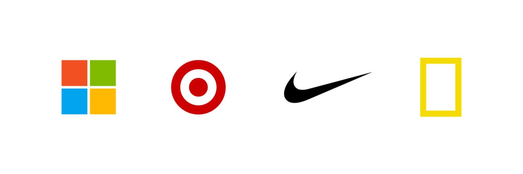
And yet, not too simple
How simple is simple? Well we could refine a logo all the way down to a simple circle, and I’d salute any brand that embraced that (Mastercard and Target are not far off), but at the same time you do want to be differentiated from your competitors. You want to be recognized and told apart from the hundreds of other companies.
Something too simplified might actually not be memorable at all (lost in the noise). A logo needs distinction so that the essence of the company can shine through. So the balancing act is well and truly alive when it comes to logo design.
A logo should be relevant
Whoever the logo is for it needs to be suitable within their industry. The HSBC logo would look out of place at Toys ‘R Us and vice versa. So through plenty of upfront questions, research and exploration a logo designer can apply stylistic choices, an appropriate colour palette, and an overall mood to the logo. This will give the logo a unique personality and a vibe that is fitting to the clients business and as a result a delight to behold. If this can be done with a twist of greatness, so rarely seen, well, then you will have a masterpiece.
Bonus reading:
What a logo is not – misconceptions brought to light
What a logo is not – misconceptions brought to light
#1
Paul Rand, one of the design greats, said “A logo derives meaning from the quality of the thing it symbolizes, not the other way around.” In other words, a logo should not be expected to enhance your business or its products. It is the good business you do that will truly make the logo shine.
Paul Rand, one of the design greats, said “A logo derives meaning from the quality of the thing it symbolizes, not the other way around.” In other words, a logo should not be expected to enhance your business or its products. It is the good business you do that will truly make the logo shine.
#2
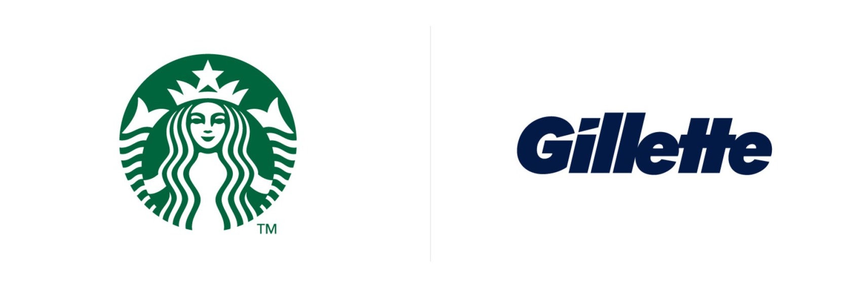
A logo should not be literal. It can be, and should be, fairly abstract. It does not need to describe what the company does. It only needs to be relevant (see above). Think of any decent company and its logo and you will see what we mean (for example, Starbucks does not have a logo of a coffee cup or coffee beans).
#3
You do not need to love your/a logo (at first). A logo is made for function and identity. The subjective views of certain people within a company are smaller than the overall integrity of the logo design. And, trust me, as the business thrives, so too will the adoration for the logo.
You do not need to love your/a logo (at first). A logo is made for function and identity. The subjective views of certain people within a company are smaller than the overall integrity of the logo design. And, trust me, as the business thrives, so too will the adoration for the logo.
#4
A logo does not need to be eye-catching or clever. Again, through clever branding and marketing you can achieve fame. The logo, however, is a form of identity. Just as you remember someone's face (ie. the logo) at a party, it’s actually their personality, manners, fashion sense and hair-do (ie. the brand, the marketing and brand identity) that determines whether you like them or not.
A logo does not need to be eye-catching or clever. Again, through clever branding and marketing you can achieve fame. The logo, however, is a form of identity. Just as you remember someone's face (ie. the logo) at a party, it’s actually their personality, manners, fashion sense and hair-do (ie. the brand, the marketing and brand identity) that determines whether you like them or not.
#5
A logo does not play the role of communicator. And it is not used to promote either. A logo is one entity of a vast amount of branding output. And it's how you brand yourself that people start to read your business.
A logo does not play the role of communicator. And it is not used to promote either. A logo is one entity of a vast amount of branding output. And it's how you brand yourself that people start to read your business.