Logo and Brand Identity for Sirris - the EV and Moto-X Bike Suspension Specialists
Sirris is a new startup located in the bicycle mecca of the world - Taichung City, Taiwan. They manufacture suspension and forks for electric vehicles, with a focus on the new and exciting world of electric motocross bikes. To launch their new company they needed a new logo and brand identity kit as their office setup, factory operations, and global networking was well under way, all of which needed a first-class brand identity.
The full Sirris logo designed by Dymantic Design
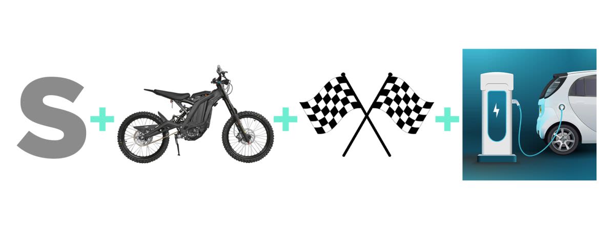
The logo should incorporate aspects of the motocross industry (Fox being one of the well-known brands), such as the extreme sport vibe, speed and ruggedness, and X factor. But, interestingly, and more importantly, also incorporate the new EV (Electric Vehicle) aesthetic that has come about in recent years. Slick, futuristic, somewhat crossing over into robotics and AI. It’s a very fun contrast, with one being all about dirt and mayhem while the other one is about clean energy and sleek innovative technology. The goal was to combine these two but not lean into one or the other too hard as the opportunities for Sirris to grow into other EV categories beyond motocross are still very possible and likely. Lastly, we should note that suspension is the name of the game here and if this can be incorporated into the logo too then that would be ideal. No problem, says I!
Elements that came up in the research phase
When coming up with the concept for the logo the image I honed in on was that of the typical shock absorber/suspension we all might imagine, that of a thick coil spring, something you might see on a mountain bike’s rear suspension or on a motorbike. When looking at this coil spring in an upright position it appears to be a never ending series of S’s stacked up on top of each other. How lucky for me the company name starts with an ‘S’. Sidenote: Here’s a quote off the internet I found: “Luck is an accident that happens to the competent.”
Just a bunch of S's
My next challenge was to make it ‘electric vehicle’ -ized. The lightning bolt has become a recurring icon in the EV handbook, especially when it comes to charging stations. I configured this icon to sweetly fit into the ‘S’ and thus give the nod that Sirris is in the electric vehicle game. The lightning bolt icon will also become a handy little branding tool as more graphic media is made.
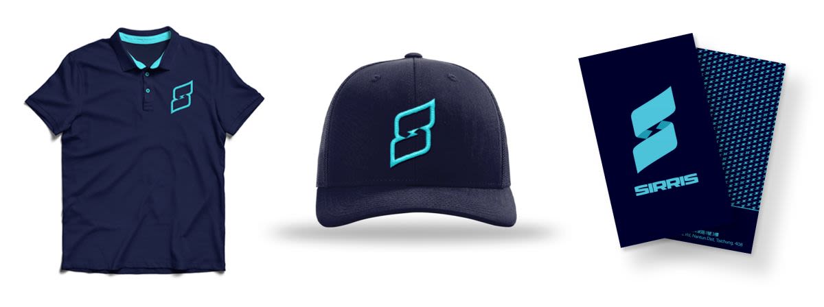
Logo and brand identity looking sharp
Finally, everything is given just the right amount of styling and finesse to suit the industry crossovers explained above, with a few additional logo iterations for good measure (I especially love the outlined logo icon seen on the cap above). The typography has a nice bold-industrial-meets-extreme-sports look, but clean and contemporary to stay within the EV market, designed nice and compact to fit in small spaces on a suspension fork.
The logo looks exceptional as a flat 2D design, but there is a lot of room to emboss and extrude it into hard surfaces
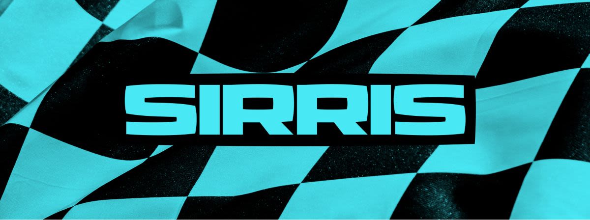
Hey presto! The logo has been a hit with the good folks at Sirris and is already adorning the many suspension units that they are shipping off to clients far and wide. Business cards, envelopes, company letterheads, office signage, and even polo shirts have been made with more to come. The spirit of Moto-X lives in the EV world