client: Specialized - Global Operations Leadership Team
industry: Bicycle Industry
location: Taichung, Taiwan
project: Logo Design, Brand Identity
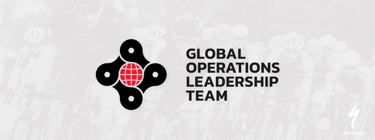
Logo Design for Global Leadership Team at Specialized Bicycles
Specialized is, of course, one of the biggest, most recognized bicycle brands in the world, hailing from the US. The Global Operations Leadership Team at Specialized Bicycles is made up of several individuals dotted all over the globe. One of those individuals is based in Taichung, Taiwan and reached out to me to design a logo for their team to use for their internal uses, such as communication avatars, branded T-Shirts and gear, presentations and documents. I was told that other departments across the board were coming up with their own team logos, so something special was needed, as these guys are very competitive!
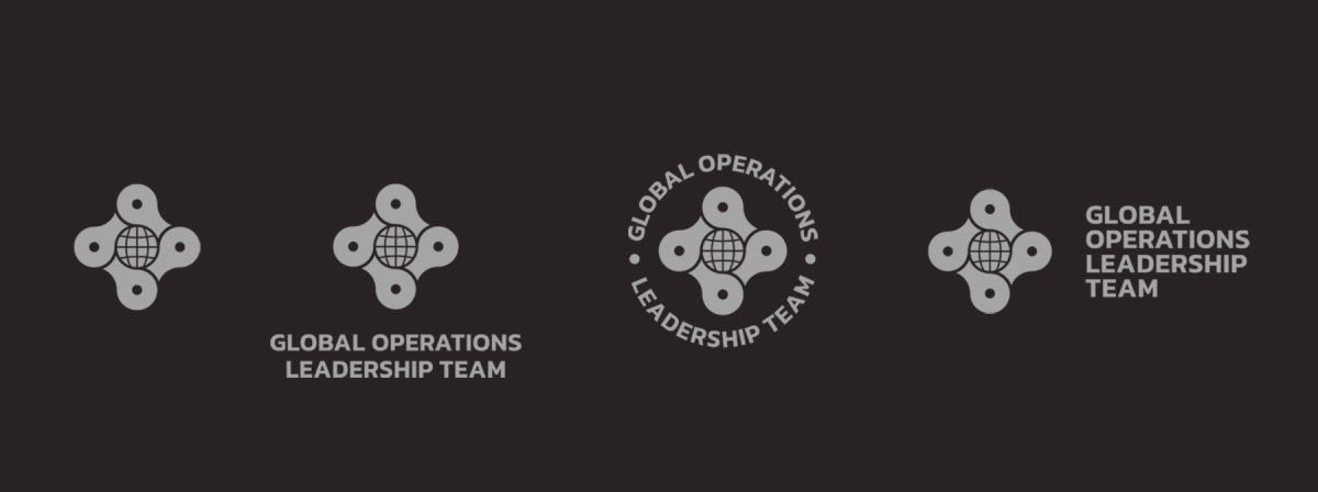
The brief for the logo included a few prerequisites, mostly to incorporate that they were a team of global, diverse and committed individuals. That, and of course their passion for Specialized and cycling. It was important to design the logo so that it would work well as an avatar, so a small distinct icon would be needed, as the name - Global Operations Leadership Team - is more than a mouthful and not easy to squeeze into a small thumbnail space.
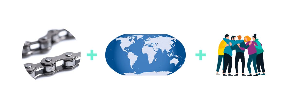
Fast forward through much research, doodling and concepts and I settled on the idea of the bicycle chain to represent the team (which, as you know, is only as strong as its weakest link), in an infinite loop to represent the ongoing commitment and hard work they do. The design itself is clever, speaks volumes, and works great as a small icon or a large graphic on a t-shirt, for example. The globe was always something I saw as an essential element, even more so than a bicycle symbol, as the team using this logo really are dispersed globally, and the Specialized brand is as international as a bike company gets.
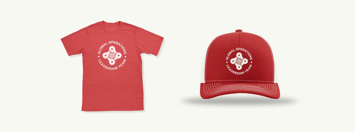
The colours were to be Specialized brand colours (red, black and white), and I kept the typography modern and legible with a san-serif called Ridley Grotesk which will be useful for all forms of branding, from document body text to emblazoning the logo on giant flags at the next bicycle exhibition.

One thing I found quite nifty about this logo is the capability to switch out the globe for something else, just as a potential branding option. So if this team was to be representing Specialized at an event they might opt to put in the Specialized ‘S’ icon; or if they were at an E-Bike convention they could switch it for a little electric lightning bolt, for example.
Overall the logo was very happily approved and the good design work appreciated. Everyday the Global Operations Leadership Team members will see it in their communication apps and other internal media, and I hope that it is giving them a greater sense of unity and teamwork.
What they said…
Close communication and flexibility all the way to a great outcome! Really recommended.