client: FK57 - Online Betting and Gambling Website
industry: Entertainment Industry
location: Taichung, Taiwan
project: Logo Design, Brand Identity
Logo Design for Taiwan Online Betting and Gambling Website
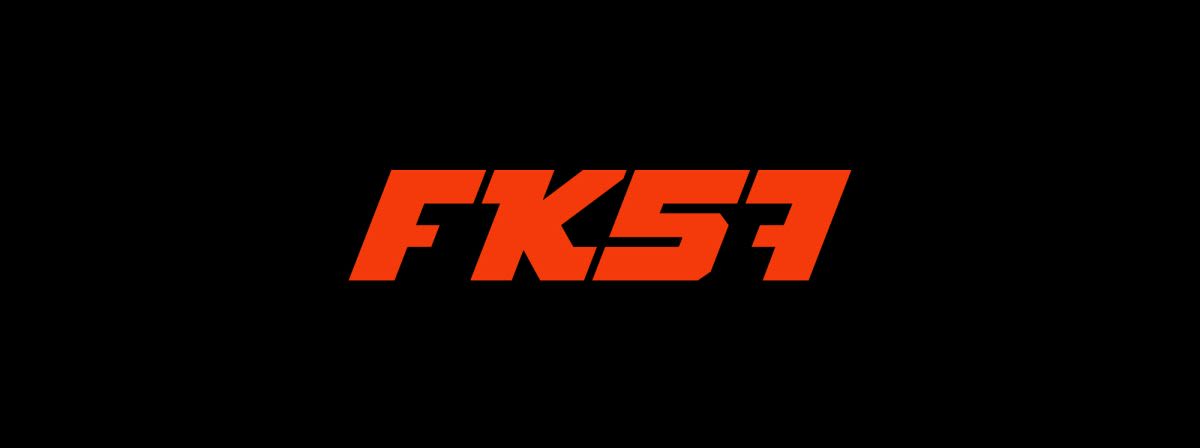
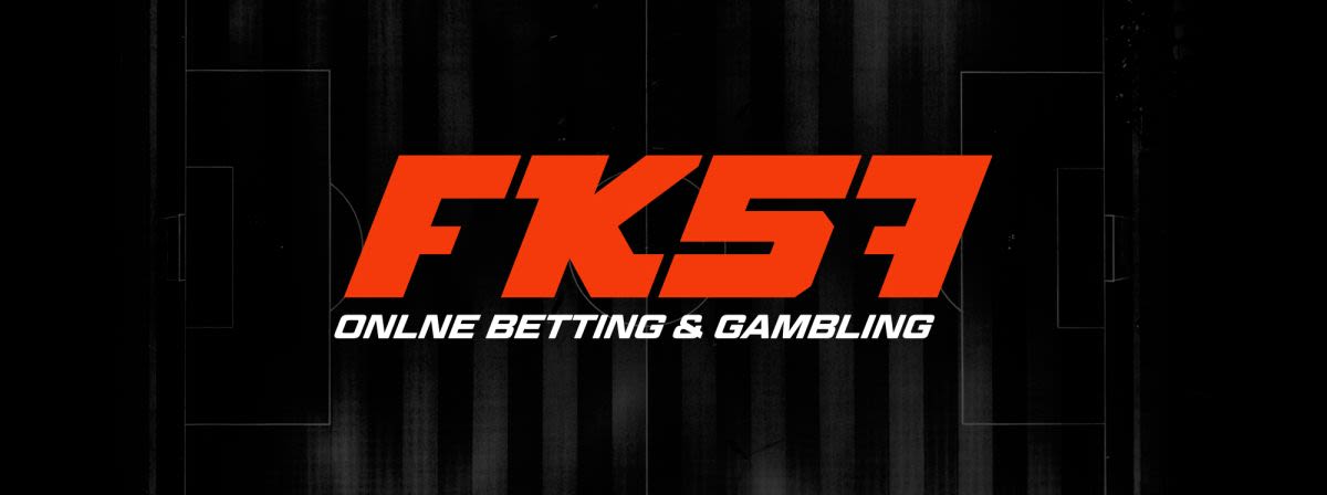
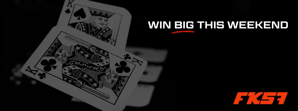
FK57 is a new online gambling and betting website from Taiwan. It includes all the usual betting and gambling games, including cards, sports betting, lotteries, chess and fishing, to name a few. The logo design and brand identity for this online betting and gambling company needed to fit in with a website that was being built at the time, which already had a certain style and aesthetic to it. For example, the bright red on black was a colour theme already chosen, and a somewhat futuristic/tech kind of feel.
I wanted the logo to feel a bit sporty and sleek, thinking of the clientele that may use this website. As if it was a team logo upon a football jersey, and everyone who used this website felt like they were part of the team. I also had to be aware that it is a logo that will predominantly appear on the website or an app. So it should fill the usual locations a logo is usually used on these applications well (ie. top right corner of a website, app icons, etc).
The logo is a wordmark, meaning that it is only made up of the name of the business, and there is no icon. This works well for the unusual name: FK57, as it is short and intriguing. I custom designed the letters to look racy and slick, and fit within the online betting and gambling niche, and come across as a sports teams logo, as mentioned. There is a nice little quirk in that the ‘F’ and the ‘7 ’look like mirror images of each other, creating some nice symmetry the wordmark logo. The result is a very well-balanced, sporty, eye-catching logo.
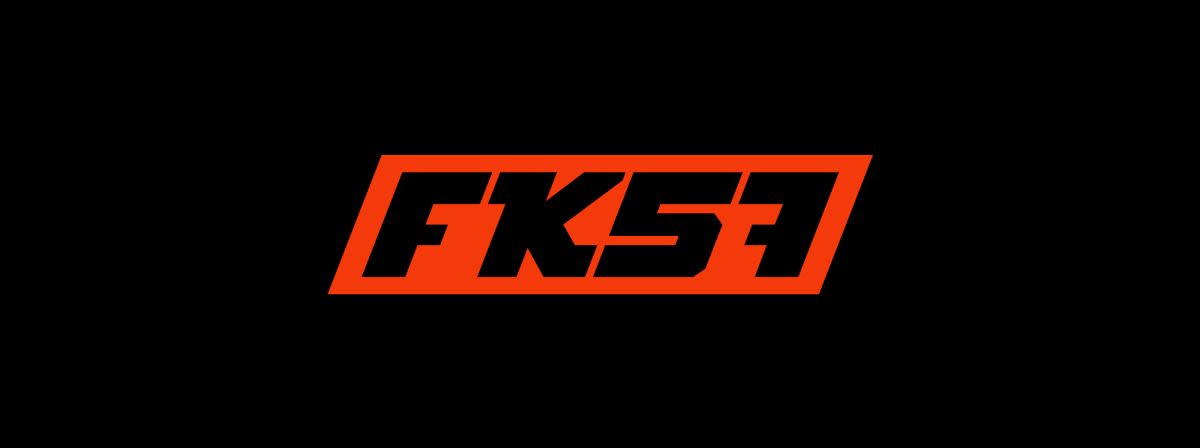
A very nice aspect of the logo is the square version, whereby ‘57’ can sit under ‘FK ’and make a square-like icon. This is very practical for the digital aspect of the branding, as it can be seen in small circles (like favicons, app icons and avatars).

The logo design was extremely well-received by the company boss and his partners and said to be “exactly what we wanted”.
What they said…
Exactly what we wanted!