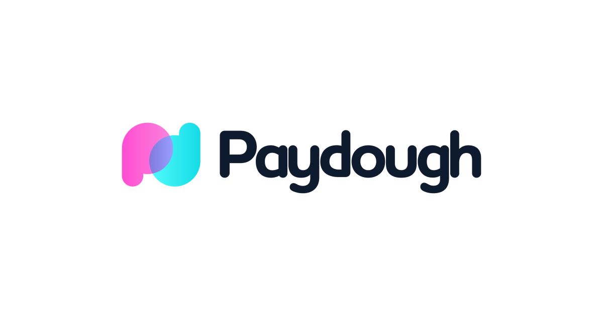
Paydough is a UK-based payment app geared towards sports and social clubs and small businesses who need to take regular (subscription) or once-off payments. They called upon Dymantic Design for a logo design that would make them look well-established in the fintech industry and captivate its audience straight off the bat. With such a clever name they were spinning we could not refuse. The play on words in the name was actually quite a tricky design obstacle to navigate. It would be tempting to anyone to actually go for something resmebling the all time kids favourite toy Play-Doh in the logo. It is, after all, an incredibly on point play-on-words. It would be hard not too. In fact, was it indeed necessary, we wondered. We concluded no, for the most part. To give Paydough their edgy, silicon valley-esque, fintech star appeal it needed to be seriously clean, professional and look stunning on the app store. To add any gooey, primary coloured, kiddies features would be disastrous, despite the client saying they did want to go for something fun and aimed at youthful adults.
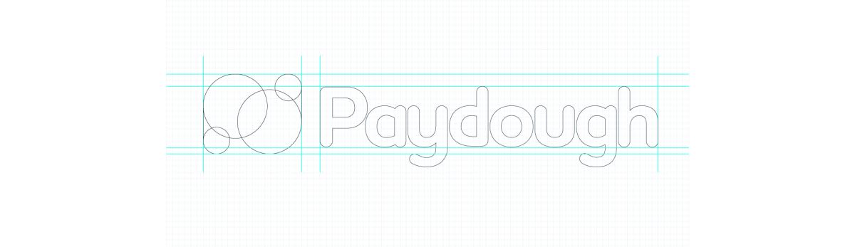
Simple shapes make for a memorable logo Having said there would be no Play-Doh traits in the logo we did want to give the tiniest of nods, as if it were almost like an adult Play-Doh. The use of the rounded, bubbly font was no coincidence which adds a really nice fun, cheerful presence yet it is such a clean, well-constructed, modern font that the bubbly personality of it is kept at bay when needed and it can look slick and trustworthy on anything from UI interfaces to Terms & Conditions. The sky is limit when it comes to the branding. Fun yet slick, edgy yet professional. The mark itself is cleverly made up of the two letters of the words in the name, which can be simply flipped to represent either creating a memorable symmetry in the logo. Uppercase 'P' becomes lowercase 'd' and lowercase 'd' becomes uppercase 'P'. This wasn't always the case (!) as the original wording was 'PayDough', but this wasn't set in stone and freedom to explore the name punctuation was, gratefully, given to us by the client, allowing this little opportunity to present itself through much exploration.
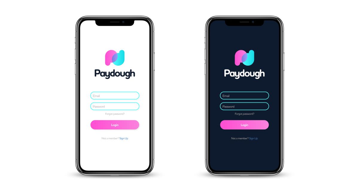
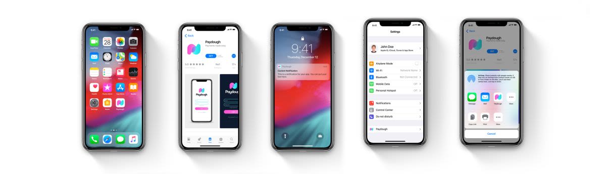
Other than that we have some attractive, modern colours giving the logo, and the subsequent Paydough branding, a vibrant, high-profile look and sheen which should sit well with the intended audience and help it to rise above the competition. The interconnectivity of the 'P' and 'd' shape is a nice symbolism for trust and partnership, things we look for when doing business with others. The logo works great on the all important mobile device. Overall the logo has done well to give the smallest of smallest nods to its initial play-on-words source with some nice chunky simple shapes, yet it is incredibly suited to the fintech industry of today - clean, punchy, daring. As far as an application you want to be sending and receiving money on goes, this looks legit and something you'd be pleased to open up on your smartphone.
What they said…
And just to reiterate. We seriously love it. Super impressed. Thank you!