Taipei Bike Store Logo, Brand Identity & Website Design
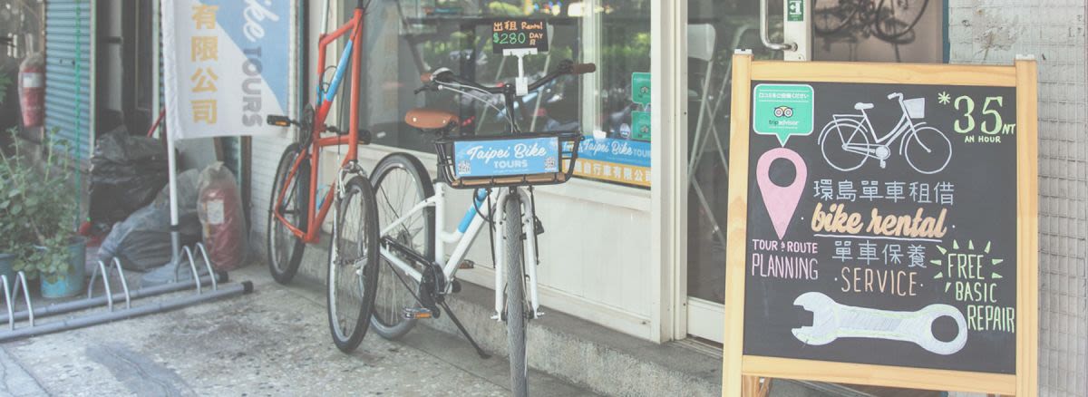
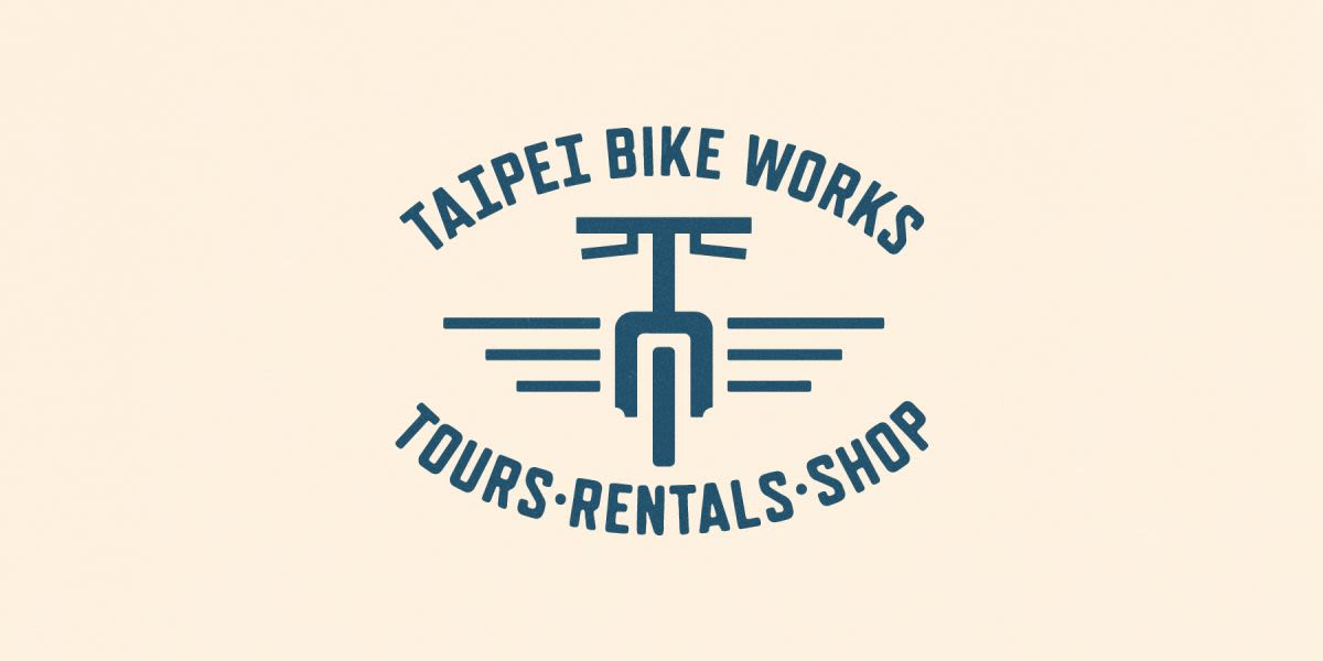
Taipei Bike Works is located in the heart of Taipei City and it was started by a couple of American gentlemen with a huge enthusiasm for cycling and adventure. As a result the bike shop opened not only renting bikes and offering repair services but also offering city tours of Taipei. Their knowledge and expertise for all things cycling and Taipei soon made them well known and business took off. But it doesn't end there. There knowledge and experience goes way beyond just the city and they are a great resource for information, as well as everything one might need, for cycling trips down the east coast of Taiwan which just happens to be one of the most scenic and challenging road cycles on earth, all done on a cyclist-dominated highway. Stop by Taipei Bike Works for all your cycling needs from some of the friendliest folk around With all this on the go Taipei Bike Works reached out to Dymantic Design to hit the refresh button on their branding and website. The company was at a crossroads too. Were they a tour company or a rental company or a bike shop? They had a divided their name into more than one entity so it was a great opportunity to get everything under one roof and define what they are. As a result the name of Taipei Bike Works stuck (previously Tours and/or Works) and they are a Rental, Tours and Shop bike store. The new logo - polite, retro and does what it says on the tin. For the logo, we were drawn to something of a retro style due to the array of vintage bicycles and fixies that they displayed in their store and often refurbished. It was also a goal from the start to allow the logo to curve around a headset, top tube or seat post should it be made into a sticker. This is something you see on bikes a lot and would fare well for the promotion of business to put stickers on their customers bikes and their rental bikes. So you can notice the bike has 'wings' giving a more oval shape to the composition, which will work well to wrap around tubes and poles and posts, and overall a 'badge' style which is gives a retro feeling.
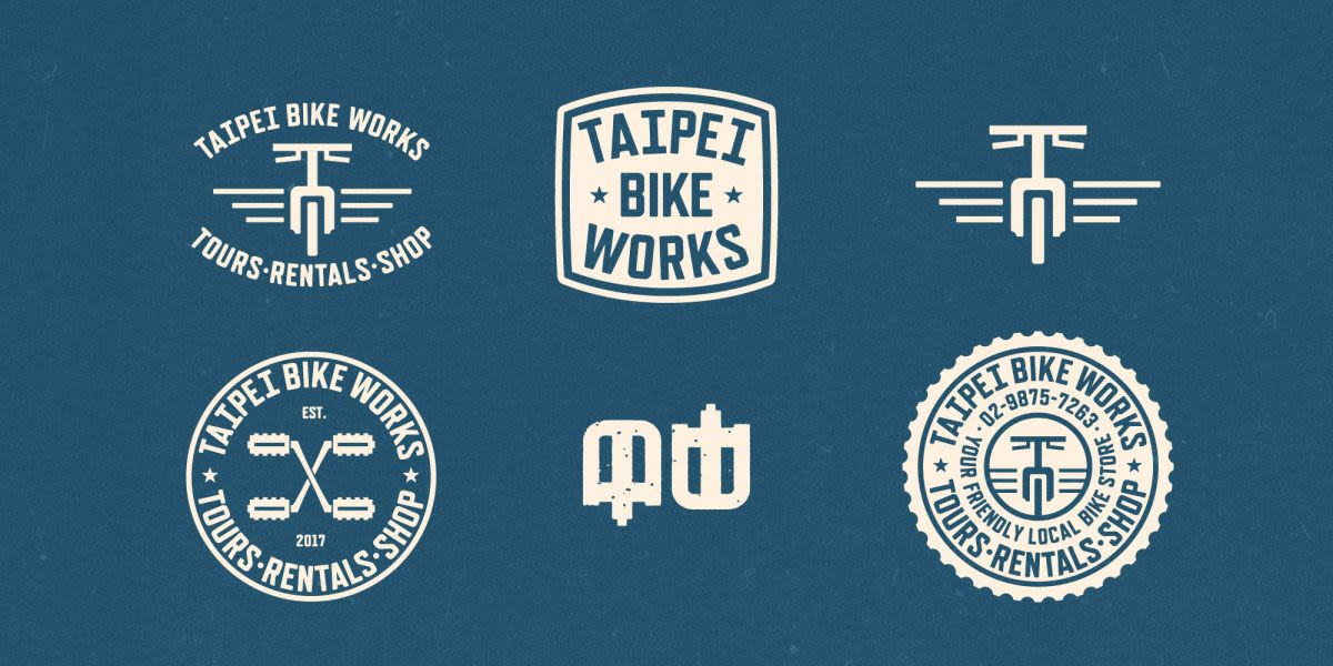
Along with the logo we made a few extra branding elements to help to certify their identity. Some of these were used on the website. Branding elements for marketing, shop decor and merchandise Onto the website, the bread and butter of this business. So many people search for Taipei City cycling routes, rentals and tours as well as the before mentioned Taiwan East coast cycling and often land up on Taipei Bike Works website. In fact, their blog post titled "Taiwan Cycle Guide" has become somewhat of a go-to reading for newbies in Taiwan.
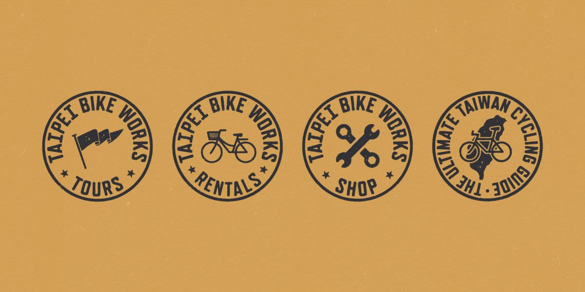
The website is clearly divided into Rentals, Tours and Store. You'll find the same 'retro' style coming through and some really nice little details in the iconography and navigation. Best to go look at the website now, just click here! Custom badges for each sector of the business, plus one for the popular Taiwan Cycling Guide article. We're happy to say that Dymantic Design has very satisfied clients in Taipei Bike Works and we look forward to seeing their business grow, which it will now do in style!
For any logo, branding and website design please contact us.
What they said…
I was looking for a complete design of my logo and website for my small business in Taipei. Max was the perfect choice! Max and his team walked me through every step of the way and I am very happy with the results!