If you've been following our work you'll recall a while back we did a really smart logo for a business called ROBOX. Yes? Well, that company has restructured, refreshed and revitalised and they are BACK! But this time as 'amomii' (pronounced 'a-mo-me').
Same products and same general vibe, but with an improved business plan and vision this time. While the ROBOX logo was well received and celebrated, unfortunately the name ROBOX appeared elsewhere on the web. So with all the new restructuring of the company it was decided that a new name and logo was needed.
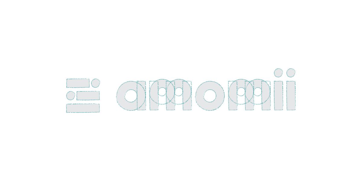
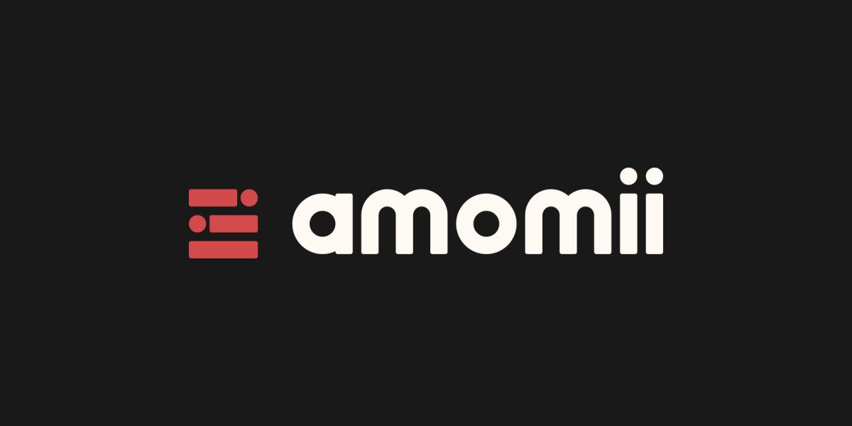
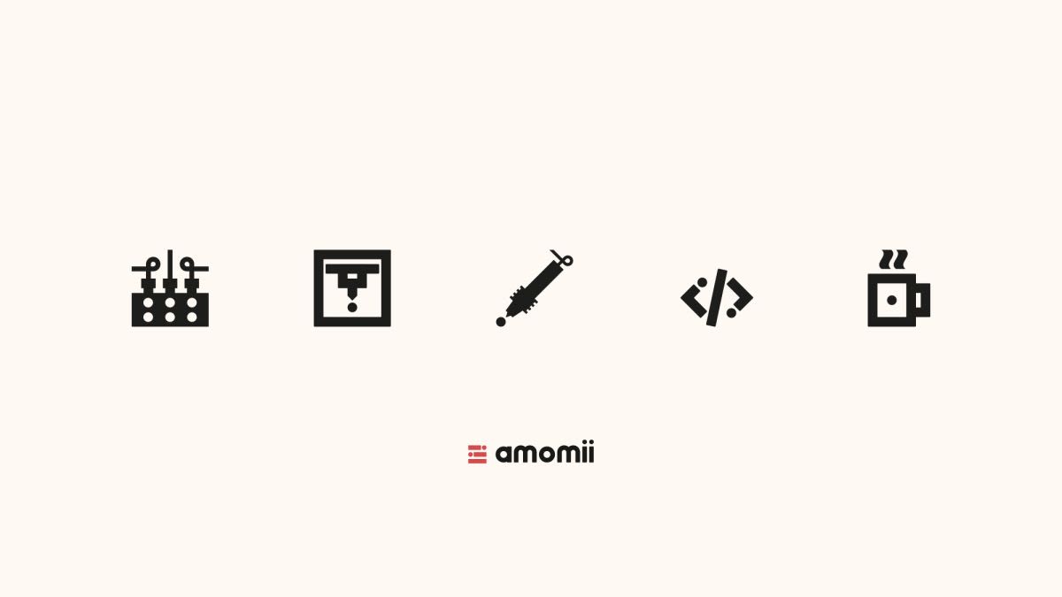
As always, amomii owner, Shaun Armstrong, wanted the logo to be cool, slightly retro, a techy/geeky feel, and something that all ages would appreciate. The products amomii put out are DIY robotics kits that then become useful household items, such as self-watering flower pot, an alarm clock; an MP3 player, a drum kit, and so on. What I wanted to convey in the logo was the sense of 'building' or 'building blocks' since the key element of the business is indeed giving someone the building blocks to become an engineer. Another thing I was drawn to was the circuit board appearance, which has all those feint lines with interesting angles and little circles at the end of each line. I custom designed the typeface because I wanted to get the real 80's lo-fi retro look I envisioned for this identity. I also wanted keep all the letters lowercase because there was some really nice repetition in the shapes of the letters, plus keeping the brand friendly and approachable for all ages. The shapes from the letters then went on to make the logo mark which was based on the building blocks concept I had in mind. It also has that puzzle-like thing going on, whereby all the pieces fit perfectly, all within a perfect square. The dots have become symbolic and fun to incorporate and now appear in other branding devices such as icons. they also hark back to what I mentioned about the circuit board lines and circles. The dots in the logo 'are' those little circles. The amomii team were very pleased with results and will be using this logo without further ado as they build out their brand and start putting out products. At Dymantic Design we are celebrating that we have been able to deliver yet another fantastic logo that ticks all the boxes and has immensely pleased our client. We were also assigned to come up with an icon set for the five major steps in amomii robotics kits, which are TEST; PRINT; BUILD; CODE; USE. You can see how the running theme of the dot from the '"i" in the name has been used in each one, further strengthening brand recognition and giving amomii an authentic and professional appearance.