Bringing style to education - A Logo for a School in Taiwan
Emerald English is a cram school (Bǔxí bān, 補習班) in Taichung, Taiwan. The school was looking for a fresh start in its branding and how it is perceived by its clients, starting with a new logo and branding identity, as well as a website.
After speaking with the owner we were delighted to know that she wanted something simple, clean and minimalistic. She had a good understanding of design and wanted to differentiate herself from other cram schools who seldom put too much thought into their branding.
Despite being a school for young kids she wanted the logo and branding to speak to the parents and give an air of excellence and importance. So no clichés like primary colours or doodle images were required for this logo. We thought this was a great business move by her. In Taiwan the cram school industry is massive and you can find cram schools lining up on most streets throughout the country. As you can imagine the majority of these have opted for something very playful and, unfortunately, third-rate. So differentiating her brand from the typical competitor would help distinguish her business and elevate it from all the other riff-raff. It’s a great example of how hiring a decent designer to do some work for your business identity goes a long way.
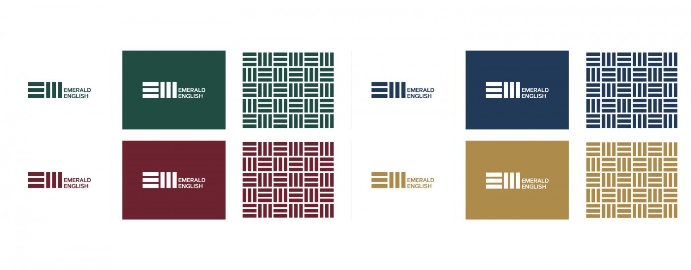
Combining 'E' and 'M' has some interesting results.
It was requested that the logo be the letters ‘E’ and ‘M’ together with the words Emerald English alongside it. Keeping the minimalistic and clean goal in mind it soon occurred to us that the E and M shared similar traits and could be made up of the same DNA (3 parallel bars) with the ‘M’ flipped 90 degrees. We thought this looked great, was wonderfully simple and modern and would be instantly recognizable from the street or wherever it is seen.
The final logo. A neat and tidy logo for a neat and tidy school.
Furthermore the simplicity of the pieces that make up the logo allows for some great branding to take place across Emerald English’s school and stationery. We came up with this unique pattern that is very versatile to use in the background. It’s a clever device to help assert the brand. It has been used on the business cards and website in very subtle ways.
We love this pattern and it can be used subtly throughout the school's decor and mediums.
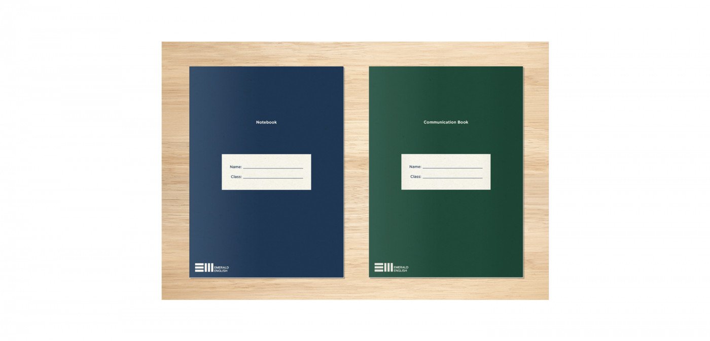
The logo was well received and we are told that every day that goes by it becomes more and more appreciated and part of the school framework. It is interesting to note that logos aren’t always loved at first sight but as they get used and the business starts to incorporate the logo and let it function for the business it really starts to become an incredible asset and a badge of honour. Along with the logo a brand identity is starting to take shape. On top of this we have made a very small website for her to introduce her business and make herself known to the google-ing world, as well as applying the new identity to several items she needed branded such as business cards, notebooks for the students and signage. The two notebooks that have been made using the new brand identity. As a result her school looks like a mature business with a strong sense of professionalism put on her academic services.