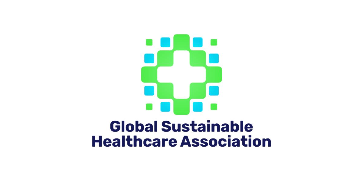
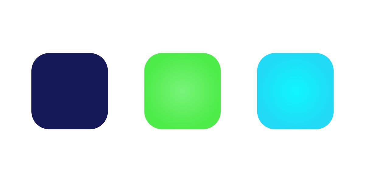
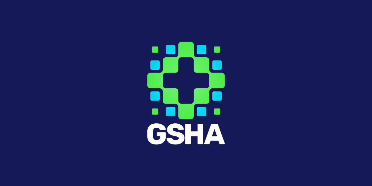
It always feels good to do some design work for an industry that is really making a difference to humanity. Fortunately we've had this experience a few times thus far in our careers, and hopefully many more to come. It was an incredible privilege to design a logo for the Global Sustainable Healthcare Association - a new foundation of the renowned Chunghua Christian Hospital in Taiwan. This hospital has a history dating back over 100 years and has a reputation known internationally. They are one of the top hospitals in Taiwan and an innovator in many medical fields. The Global Sustainable Healthcare Association, or GSHA for short, is a new project within the hospital that looks to provide a platform to bring people working in the sustainable, smart healthcare industry together. This new department wanted a logo that incorporated that message, as well as look fitting within their hospital's overall image. As we can see the logo expresses the medical aspects with the easily recognised cross symbol, which is stylistically expanded further to give it the 'smart tech' futuristic look and feel. There is an element of 'connection' and growth in the design, yet we have managed to keep all elements cohesive and compact. As per Dymantic Design's logo design style the mark is simple and the elements are subtle, making for a memorable mark that will stand the test of time. We especially wanted to keep the symbolism in this logo clear as it will be seen in a hospital, aside from the usual variations of media, and therefore must have a quick and easy grasp to the passer-by. Furthermore, despite the logo living in Taiwan, it should communicate 'international' and forego any cultural nods, as the association interacts with foreign peers and visitors regularly. The name is quite a mouthful so the logo needed two versions, whereby the full name or its acronym can be used simultaneously. The typography is strong and clear and reads well, again, not wanting anyone to second guess anything even for a split second (because split seconds count so much in the medical field). The colours envisage a strong sense of environment and cleanliness, with a vibrant modern, 'techy' hue. The bold navy text keeps it grounded and professional. The colours also invert beautifully so the logo can be used on a variety of backgrounds on the various platforms it will be used. Overall we have solid, meaningful logo design that our client absolutely loved and it will maintain the brilliant reputation of the hospital it belongs to and the great work of the Global Sustainable Healthcare Association does.