client: MKEnX
industry: Medical Healthcare Manufacturing
location: Taichung, Taiwan
project: Logo Design and Brand Identity
Logo Design and Brand Identity for Leading Taiwanese Face Mask Manufacturer - MKEnX
MKEnX is a Taiwan based company that specialises in face mask materials and the machines that make them. The acronym stands for Material, Knowledge, Equipment and Export. Their big brother is MOTEX which is one of the biggest producers of face masks from Taiwan. MKEnX helps businesses set up their own mask manufacturing operations with turnkey solutions, including machinery, knowledge and instructional guidance and consultation. While they've been operating for a few years under the MOTEX brand they have recently transitioned into a separate self-reliant business, and so a new logo and brand identity was needed.

An interesting detail to point out is that in my early meetings with the CEO and Marketing Manager a couple of requests came up for me to consider for the logo design and overall theme. The CEO had an interesting idea about a fictional medieval setting, King Arthur times specifically, whereby the ever-wise and aged Merlin the Wizard symbolises the grand CEO of big brother company MOTEX (who also happens to be the MKEnX CEO's father) and all the employees and customers are the knights of the round table. Of course, all the principles and values that came with those of King Arthur stories would be used in MKEnX's business ethos and company culture. Whilst fairly bizarre sounding at first it did actually have noticeable parallels (the head CEO does actually look quite Merlin-esque) and it's always good to have a theme to work off. But let me say, at this point it is the designers job to manage grandiose ideas before they get past the point of no return. MKEnX after all is in the manufacturing sector with a focus on healthcare. So I promised a bit of medieval magic but nothing as far as to give concern to potential clients about the company's purpose.
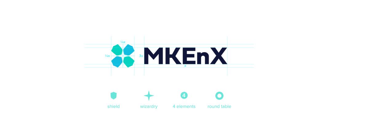
The logo is strong, symbolic and appropriate. The idea stemmed from the shields of medieval times, with a nice metaphor for 'protection', as face masks do, and then organised into a cross (more medieval symbology, but also healthcare), or X, shape. In the middle of this X shape’s negative space lies a magical twinkle, the very nod to Merlin I had promised. And so the balance was struck and MKEnX had their logo. The typeface keeps things professional, solidified and modern, further implying a company of great reputation and authority in the business.
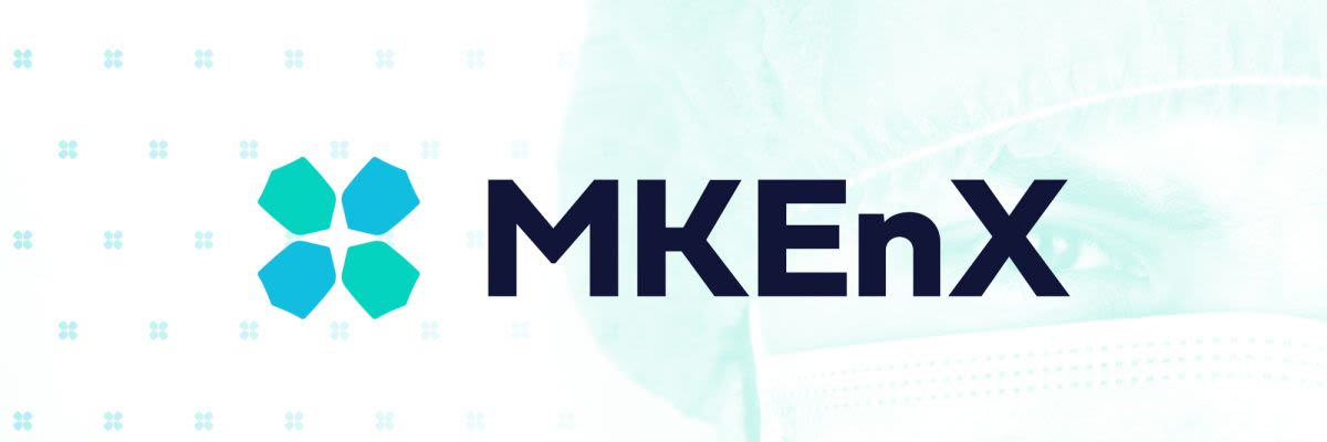
Beyond the logo we set out MKEnX’s brand identity, including typography, symbols, colour schemes, backgrounds, business cards, documentation layout and templates, and so on. The business can now thrive in its marketing and advertising and grow the brand from strength to strength.
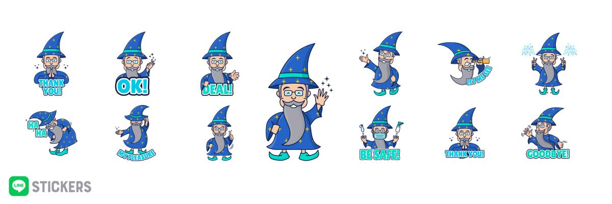
Another interesting request from MKEnX was for Line stickers. If you’re not familiar with Line, it is a messaging app from Japan, much like Whatsapp, which dominates communication in Taiwan. The apps popularity is largely driven by its stickers a user can use to make communication fun (think emojis on another level, from Disney characters to Hello Kitty to independent artists making fun and unique stickers). It has now also become commonplace for larger companies to create their own set of stickers to further enhance the brand in their communication within the company and to clientele. So, a Merlin mascot was to be created and a set of 16 Line stickers all with varying poses and messages needed to be illustrated. We worked with Jon Renzella, local Taichung fine artist extraordinaire, to help with the sketches and get the body movements and facial expressions right and we set about illustrating these.
The good people at MKEnX are very pleased with Dymantic Design's work, and we are very very happy and honoured to have worked with them on this.
For any logo, branding and website design please contact us.
What they said…
An absolute pleasure to work with!