client: M Cafe
industry: Food & Beverage
location: Taichung, Taiwan
project: Logo and Brand Identity
Taichung Coffee Shop Logo Design and Brand Identity
Dymantic Design was hired to design a new logo and brand identity for M Cafe, a new bakery-coffee shop-restaurant in the North District of Taichung City, Taiwan. The owner is a lovely American chap that has lived in Taichung a good many years and has the goal of bringing good ol’ fashioned American coffee shop and comfort food culture to this neck of the woods. He is going for something a bit more homey and cozy than the uber-minimalistic, super-designy coffee shops that have popped up in abundance over the years, so I was tasked with getting that vibe just right. However, there were some requests which I’ll run through so you can understand the final design better…
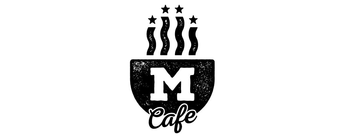
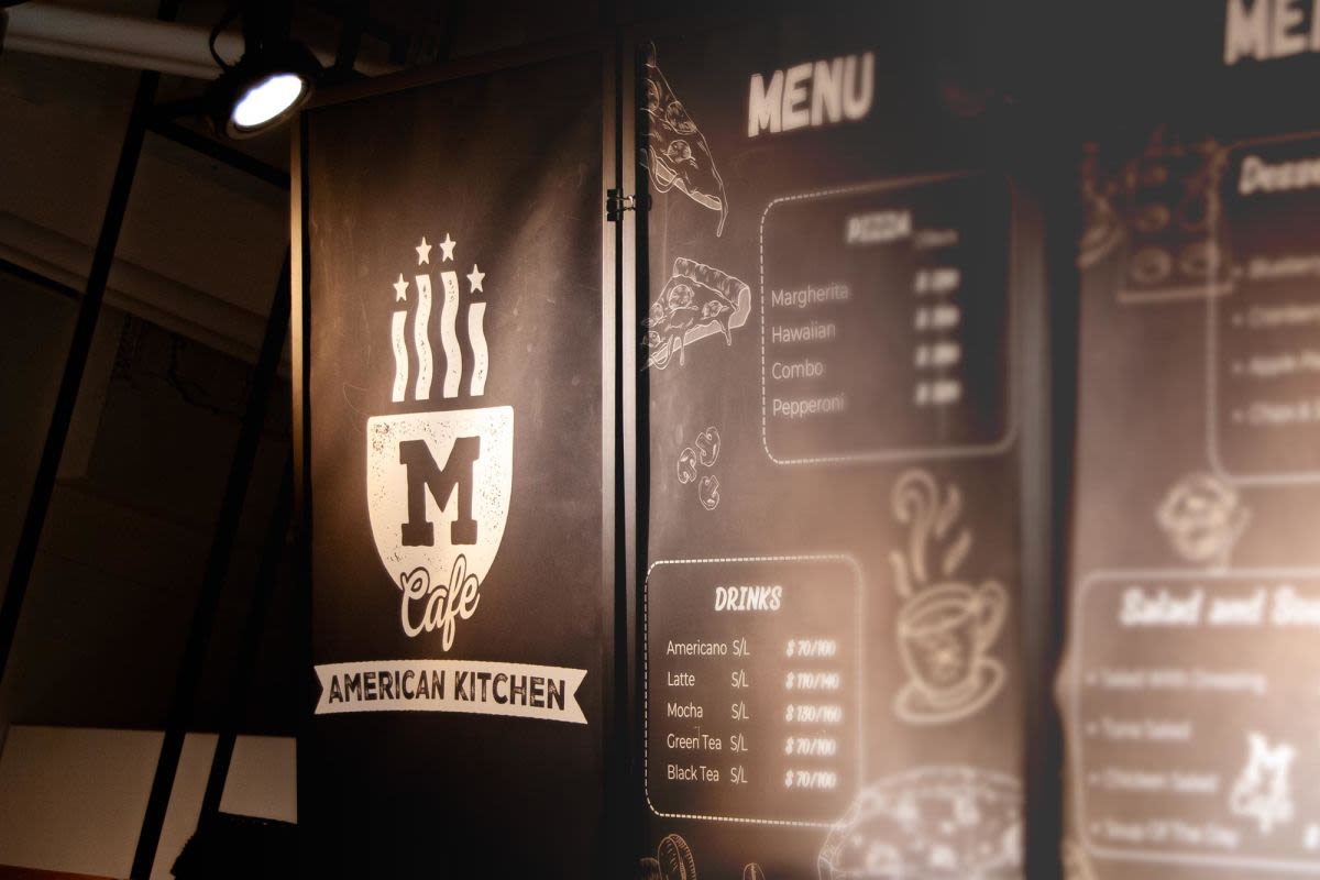
For one thing, the name ‘M Cafe’ must not be accidentally read as ‘Mc Cafe’, McDonalds well known coffee division. My solution to this was to stack the ‘M’ over ‘Cafe’, as well as make it big and chunky so the 'M' is read first and foremost and puts the correct emphasis on that part of the name.
Secondly, he wanted me to give a little nod to another food and beverage business he runs, so that loyal customers may make the connection and feel like they’re in familiar territory. This can be seen in the collegiate-style ‘M’ which will be familiar to those in the know. I found this particular typeface pleasing, regardless of any secret nods, for its Americana look and feel, as if to say, this is an American joint, ya’ll.
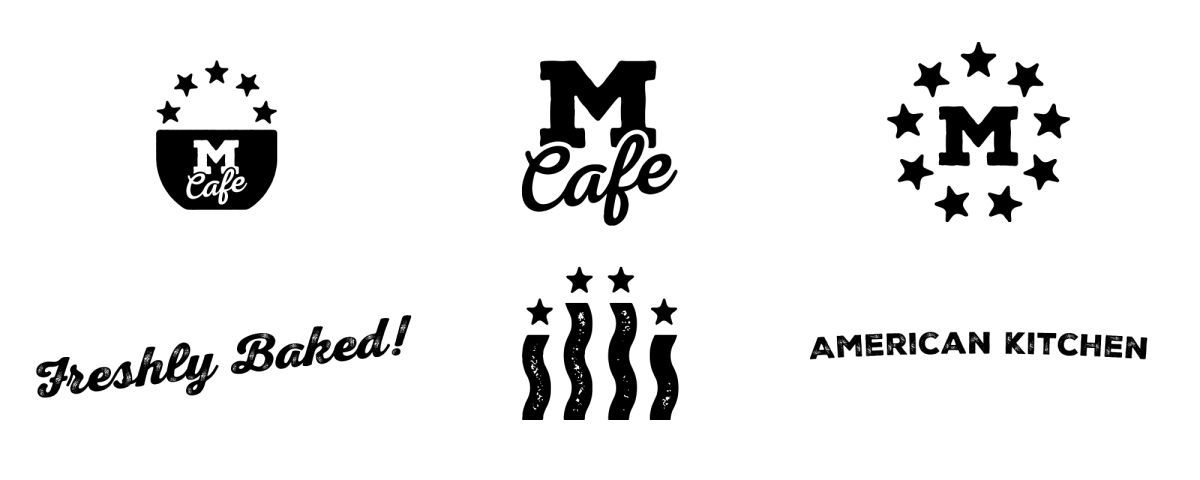
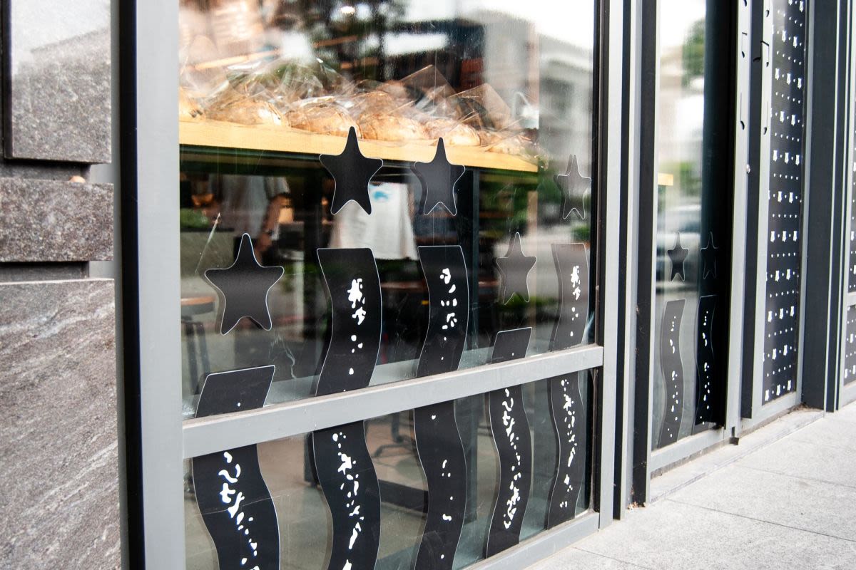
On that note, the third request was, do not hold back on American symbolism! Nothing too crazy, like a bald eagle riding a Harley sipping a piping hot grande Americano, but certainly a quick reference to the passerby that this is by all means an American style establishment. And thus we see the steam coming off the coffee cup stylised in the stars and stripes of the US flag. This little area of the logo went on to become a graphic of its own and is used as a pattern to decorate the windows, uniforms and other decorative elements around the place.
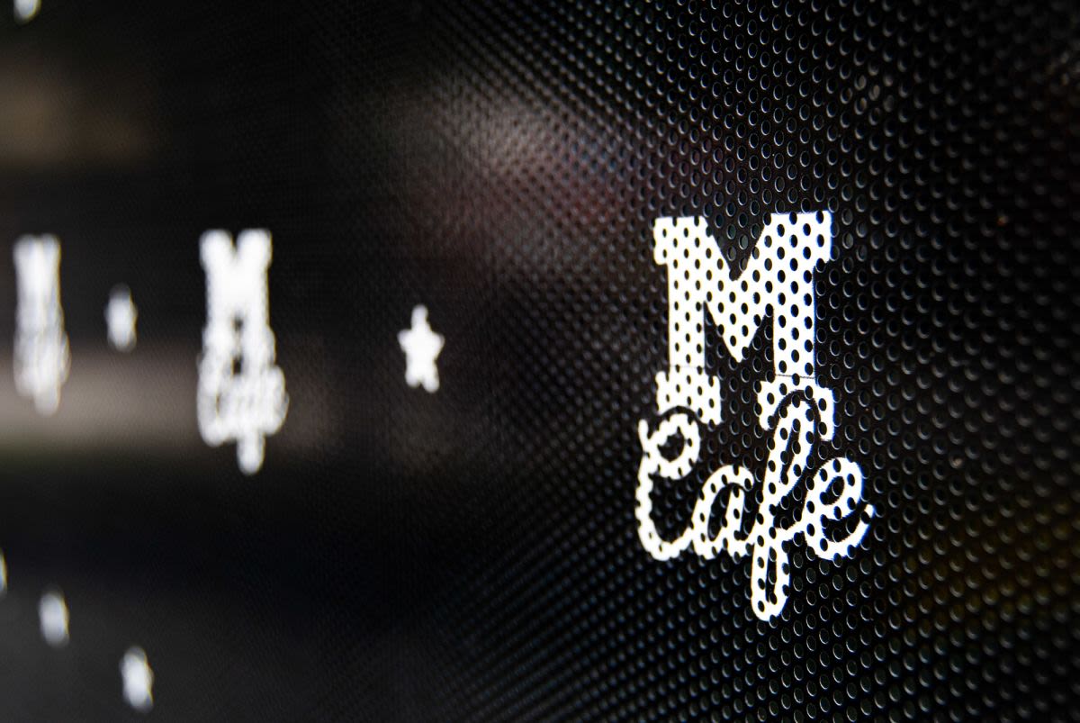
And lastly, of course, it must communicate ‘coffee shop’ and coziness. For this the simplistic coffee cup shape holds everything together and all the elements to play off it.
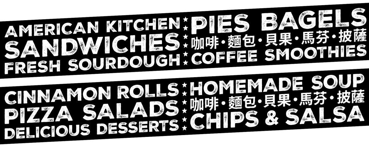
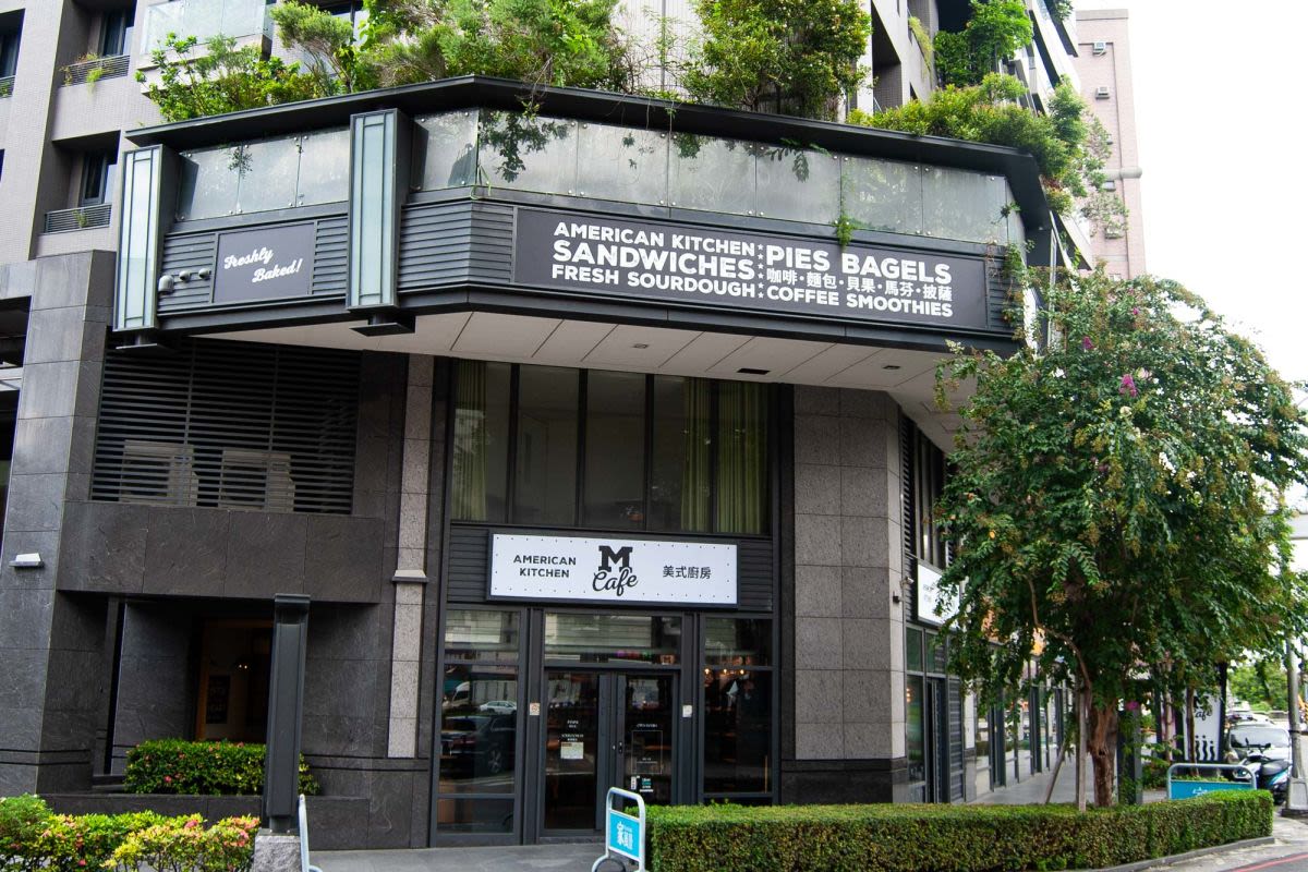
It should be noted that the location is right on a corner of two busy roads so getting passerby’s attention as to what the business is was, in this case, very important to bring into the logo. As you can see, all the elements within are very bold, clear and no second guesses are necessary. Yet everything is tied up nicely and all the requests are ticked off in smart ways. Overall, a cozy logo for a cozy place with a lot of room to expand the brand identity as the business grows too.
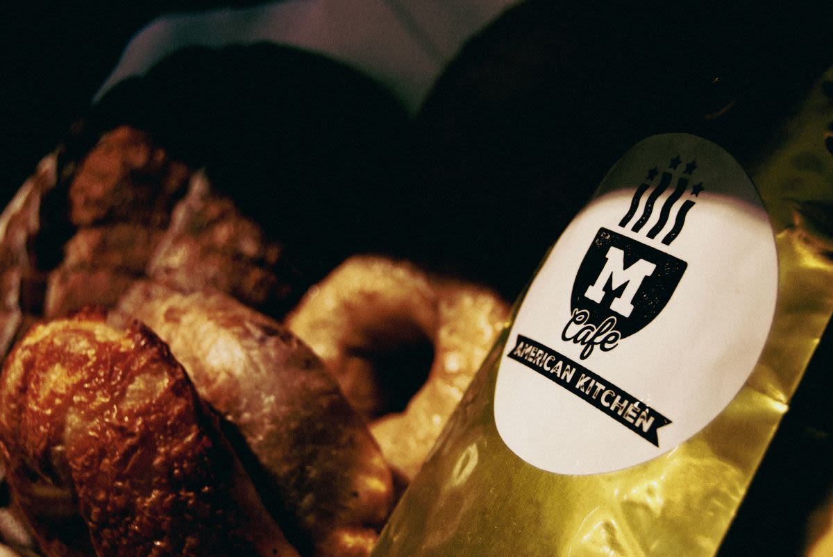
M Cafe has exceptional sourdough bread and all kinds of treats plus coffee. Go check them out, here is a Google Maps link!
M Cafe has exceptional sourdough bread and all kinds of treats plus coffee. Go check them out, here is a Google Maps link!
What they said…
Max did an amazing job capturing all of the elements that we hoped for in our logo and storefront design. It was a super collaborative and enjoyable process for something that can be challenging and difficult to get just right. Max nailed it and knocked our design project out of the park and we couldn't be happier with the results!