Legibility was top priority.Let's take a moment to think about the responsibility that falls upon a driving instructor's shoulders. I'm sure things can get hazardous out there. So when you run an entire driving school a certain amount of professionalism is going to be required. York Driving School reached out to us to design a new logo for them that would be eye-catching yet professional for their business.
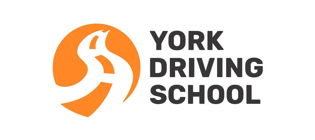
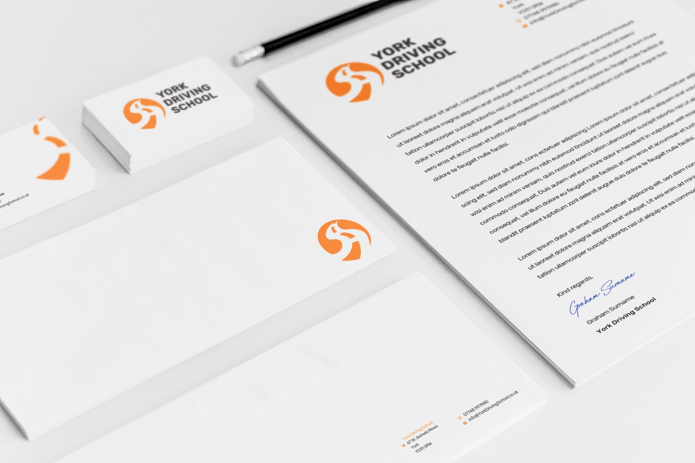
A driving school logo comes with its own responsibilities too. It needs to be bold enough for people to notice it as the learner car whizzes by, but clear enough for people to read it and remember it in that blink of an eye. It also needs to be attractive to the younger generation as it is high school graduates that make up the majority of the clientele, but at the same time it needs an air of maturity and professionalism to instill trust and safety. Furthermore it needs to look equally as good on a car door as it does on a receipt or website.
Big, bold typography was used so that it can be read as quickly as possible. The typeface is modern, but has a little retro twist to it, something the youth could approve of. The logo mark itself has has a nice little story to it – pass your driver's license and the open roads are yours to explore!